How do they do that?
Just when you thought you had a good layout you stumble on one of those ‘ultra trendy’ sites that just seems to “work”. You look at it and wonder how their site has such a balanced feel to it and why can’t I do that too…!
Lucky for us “non graphic designers” there are a few techniques that you can use to give the feeling of ‘balance’ to your graphics and text. One of these techniques revolves around a mathematical ratio called the fibonnaci sequence – actually it was known to mathematicians from India first – but I’m not going to quibble.

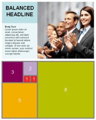
The first part of the sequence is 1,1,2,3,5,8 etc etc (this is like taking a number eg 1+1 = 2 then 2+1 = 3 then 3+2 = 5 and so on). This sequence can be applied to how you layout graphics and text. You can do it all in Powerpoint or you favourite graphics program.
Draw a square 8 by 8 (could be inches or cm) – it is the ratio that is important. Now put a 5 by 5 square next to it. Follow that up with a 3 by 3 , a 2 by 2 and a further two 1 by 1 squares – see the layout below. Once you have your template you can use it to position your photos / illustrations and text in a mathematically balanced way. When selecting your photos make sure you “crop” them to a near perfect square (it doesnt matter what size the crop actually is … you can re-size the crop to suit your ratio later). Place you text segments (headlines and body text) into using the template as indicated.
What about the web?
As this is a mathematical ratio you can use the same concept on the web – just substitute the numbers for ‘000’s of pixels – eg 8 by 8 becomes 800 by 800 pixels, 5 by 5 becomes 500 by 500 pixels. Simple eh?
I picked some clipart from the microsoft office site and have padded the text with the lorem ipsum text.
The possibilities are quite varied and could make a difference to how your customer’s perceive you and your WordPress (or other website).
Have a go and see if it makes a difference!
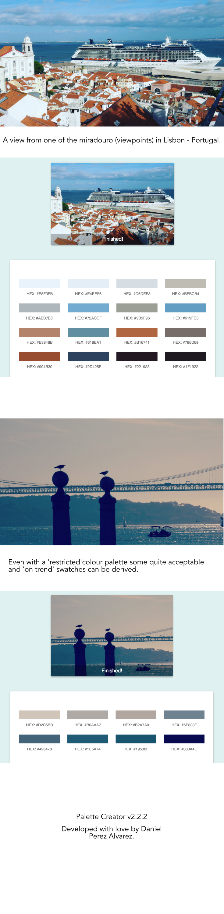
It works for landscape too!